Fra Zerohedge/ Goldman
In his exhaustive yet Q1 lookback and post-mortem, Goldman’s Tony Pasquariello (global head of Hedge Fund Sales, which these days we assume excludes family offices for obvious reasons) whose work we have profiled extensively in the past, discussed how much has changed in the past quarter, in which while stocks continued to ramp and closed 6.2% higher there was unprecedented turbulence below the surface, and is why he writes that “certain impulses changed as the quarter wore on, which presents a different setup for Q2.”
In any case, while we will look at a detailed analysis of all that happened in one of the most unforgettable quarters in history (and they said 2021 would be much quieter than 2020), here are the seven most important market charts to follow according to one of the people who is most critical in setting the narrative at Goldman.
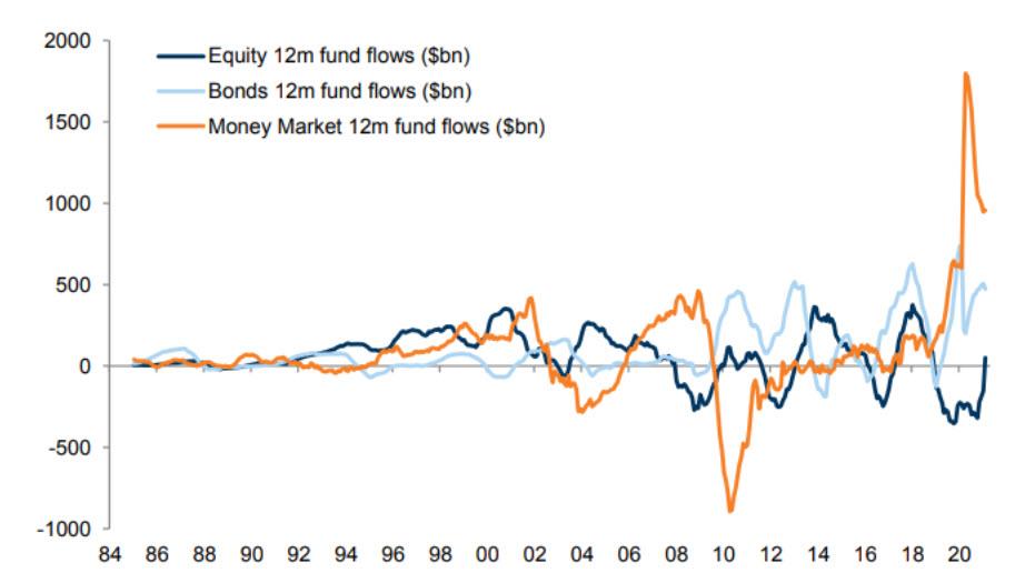
1. Pasquariello starts with the latest fund flows, where he notes that on one hand the market has seen record inflows to equity funds to start the year yet at the same time that really only marks a reversal of outflows in the prior few years (and also takes place during a burst in market volatility as discussed in “Another Market Paradox: Wall Street Struggles To Explain Record Equity Inflows Amid Stock Turmoil“). According to the GS trader, while retail demand is apt to slow from a white hot pace, it should on net remain positive “as equity funds take from both bond funds and the money markets”:
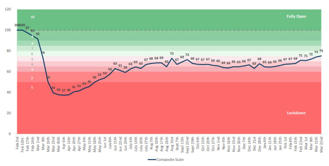
2. Looking ahead, Pasquariello says that Goldman’s composite score for the bank’s proprietary US reopening scale will be critical to watch in the coming months, as the US gets closer to normalcy with every passing day.
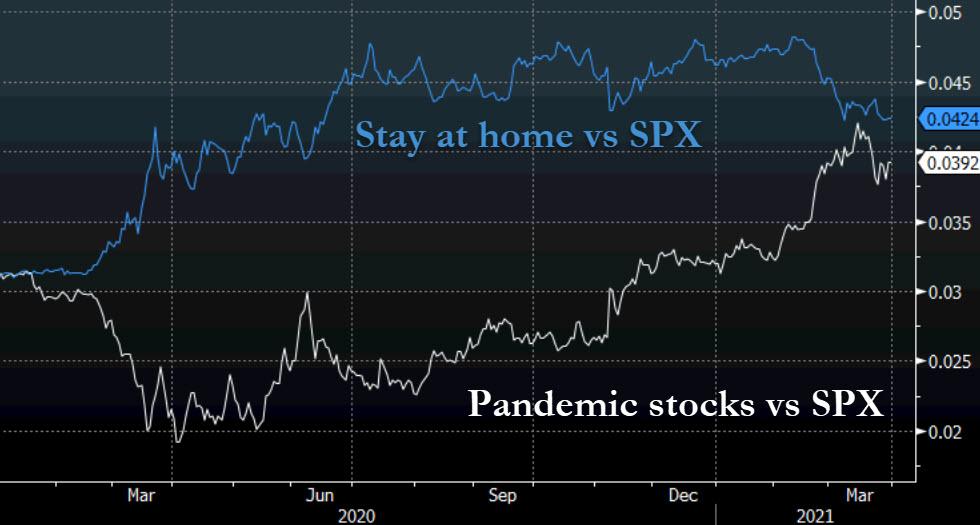
3. In turn, the Goldman trader thinks “this is a very interesting chart”: the blue line is a custom basket of stocks levered to the stay-at-home theme (GSXUSTAY), expressed as a ratio vs S&P; the white line is a custom basket of stocks most exposed to the pandemic (GSXUPAND), also vs the S&P. “As you can see, these trades did exactly what you’d expect them to do for a while. What I
find interesting, however, is how much these spreads have narrowed in recent months:”
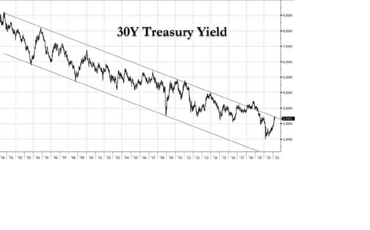
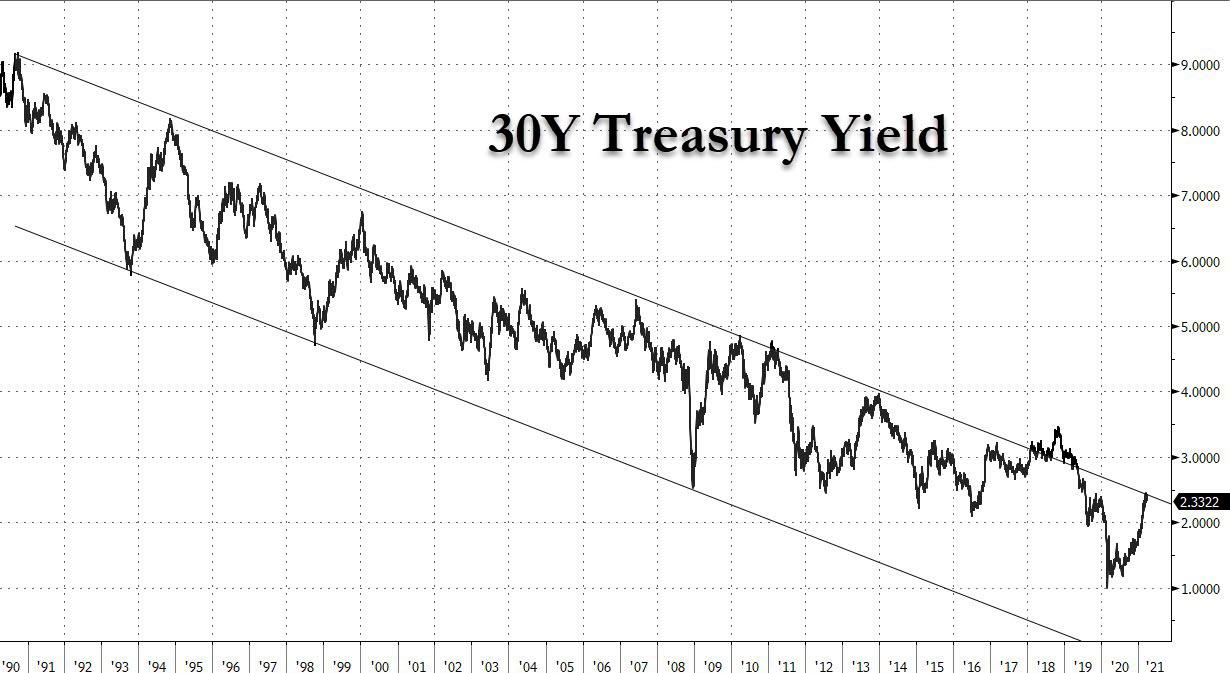
4. This brings us to the punchline: a very long-term chart of the long bond. According to Goldman, with the 30Y now at the long-term resistance line and potentially set to break a 31-year-channel, what happens next is critical, and is why Goldman asks “is there a more interest chart on planet earth right now.”
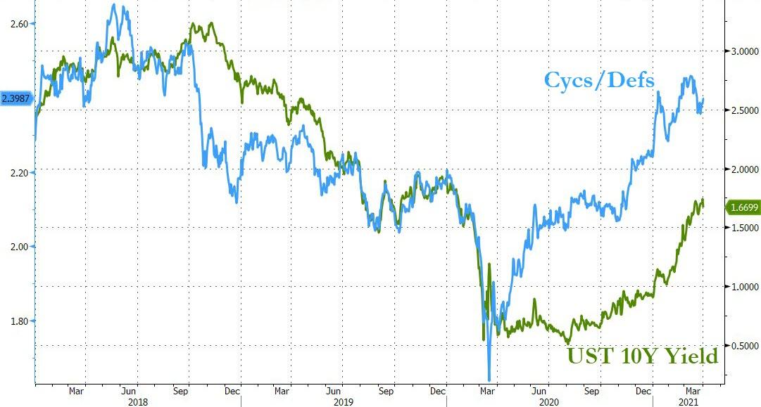
5. And speaking of the bond market, Pasquariello notes that for all the uniqueness of this cycle, the relationship between bond yields (green line) and cyclicals vs defensives (white line) is right in line. In fact as the Goldman trader notes, “look at the tell equities gave in advance of the bond move last year.”
6. One of the prevalent themes on Wall Street in Q1 has been the resurgence of faith in commodity names, and here is another reason why. The next chart from Pasquariello shows a measure of US wealth inequality. Why is this notable? Because as he writes, “the best era of US equality was coincident with exceptionally strong commodity prices. given the focus of global policy makers on the inequality issue right now, one can understand how this underscores a bullish medium-term call on commodities.”

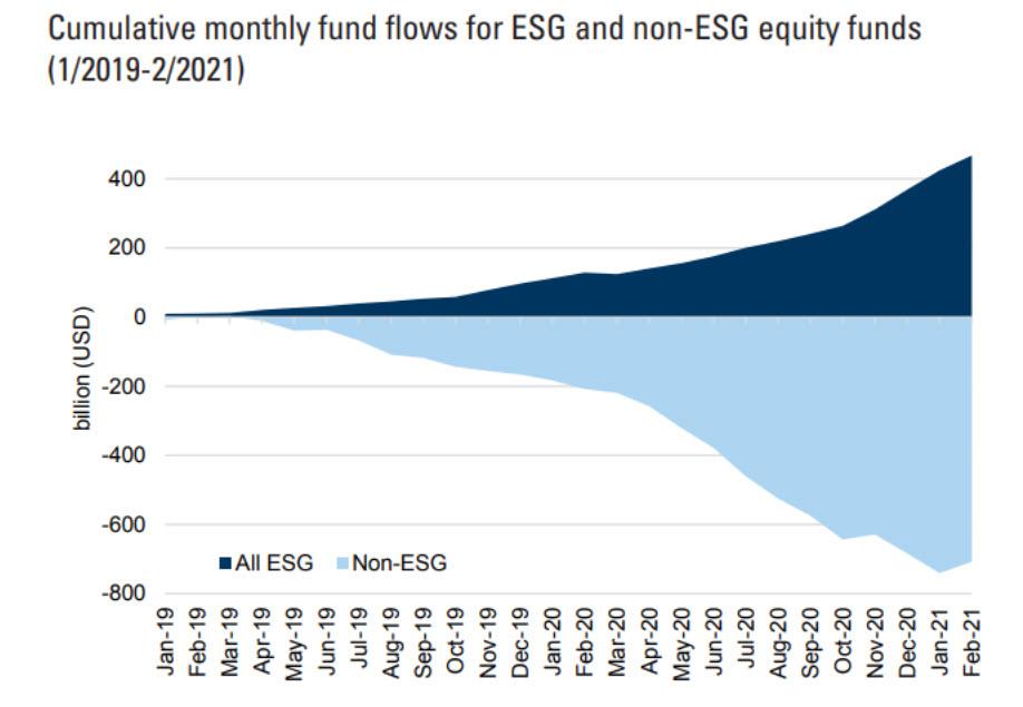
7. Finally, what chart recap is possible without mentioning the virtue signaling craze du jour: As Pasquariello concludes, “the more things change, the more they stay the same, and while outflows from equity funds have thankfully inflected (light blue) , investor demand for ESG product (dark blue) remains firmly in place” and os one of the biggest drivers of inflows into global stocks.